Master Classic Fireplace Mantel Styling
You know the feeling. You stand across the room, coffee in hand, staring at a mantel that looks like a storage shelf had a bad day. A candle that's too small, a vase that's too tall, and that one weird shell from the beach trip that never should have made it out of the car.
It's not terrible, but it's not good. Learning how to style a classic fireplace mantel is about understanding proportion, negative space, and visual weight, not just buying expensive decor and hoping for the best. You've got the bones of a great focal point; you just need a system to pull it together.
The good news? You don't need a designer or a hefty budget. You need a process.
Styling a mantel successfully boils down to a few spatial rules that interior designers use, rules you can apply in under an hour. Fireplaces pull double duty as the architectural anchor of a room, so the mantel needs to respect the firebox below and the ceiling height above. As of 2026, the standard rule of thumb still holds: art should be roughly 2/3 the width of the mantel for visual balance, and the gap between the shelf and the ceiling shouldn't feel crammed.
Ready to fix that eyesore? Let's walk through the practical steps, starting with a clean slate.
Quick Answer
Style a classic mantel by anchoring the wall first, then building three layers of height. Use the firebox for visual grounding and keep items out of the heat zone. Create asymmetry with an odd number of objects.
Add texture through greenery, wood, or stone. Leave negative space so the eye rests, and change the arrangement each season.
Before You Touch a Single Vase: The 3-Minute Visual Reset
Image source: Wikimedia Commons / Acabashi (CC BY-SA)
Here’s the dirty secret about styling: you can’t decorate an uncluttered shelf if the shelf is full of stuff. So step one involves a total reset. Take everything off the mantel.
We mean everything, down to the dust bunnies and the old matchbox collection tucked in the corner. You need to see the bare shelf, the firebox, and the wall above it as a blank canvas, because that is the only way to judge what actually belongs there. Do this now, and keep the table you set everything on nearby so you can curate as you go.
Image source: Wikimedia Commons / Wikimedia Commons contributor (CC BY)
With the shelf cleared, evaluate your firebox. If you have live flames, safety dictates that nothing flammable sits within 12 inches of the opening, per manufacturer specifications for most prefabricated fireplaces. If the space is purely decorative or you have a gas unit with a sealed glass front, you gain room to style the interior hearth, but the shelf still gets priority.
Look at what you have left on the table. Which pieces are too small to matter from across the room? Which ones have actual visual weight, meaning they carry mass like stone, iron, or dense wood?
Toss the trash, and keep the candidates in a pile.
The Firebox Foundation
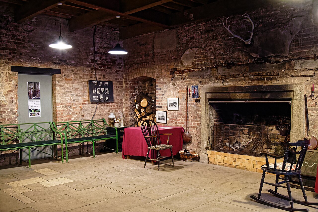
Before you style the shelf, style the hearth. Think of the firebox as the visual anchor, not the mantel. If you have an open, unused firebox, place a cast iron log holder or a symmetrical trio of tall pillar candles inside.
For a used fireplace, install a decorative fire screen that complements the room. A finished hearth below gives the eye a place to land, which makes the shelf above feel intentional instead of cluttered. This step grounds the entire design, so don’t skip it to rush ahead.
The Golden Rule of Scale
You’ve heard it before, but it bears repeating. A mantel looks wrong when the decor is too small for the wall. Measure the width of the mantel shelf and aim for the main art piece to span at least 50 percent of that width, up to 75 percent for a dramatic statement.
This creates a visual anchor that draws the eye correctly. Pair that with a simple height rule: vary object heights to roughly 1/3 and 2/3 of the distance from the shelf to the ceiling. This creates a rhythm without looking uniform or overly curated.
The Step-by-Step Styling Sequence: From Blank to Balanced

Image source: Wikimedia Commons / Yasagan (CC BY-SA)
Now that you’ve got a clean slate, follow this exact order. Do it out of sequence, and you will fight yourself for an hour, moving the same vase back and forth.
Step 1: Anchor the Wall. Grab the mirror, art panel, or large clock. Lean it or hang it slightly off-center, leaving room for a tall object on the other side. Don’t center it unless you have a symmetrical room, most people don’t.
For a classic look, place the center of the anchor at eye level, about 6 inches above the shelf.
Step 2: Build the Backbone. Place your tallest focal piece on the opposite side of the anchor. Think a tall vase, a pair of candlesticks, or a potted olive tree. This creates a diagonal line across the shelf and stops the eye from stopping dead center.
The rule here is simple, one side should feel heavy and tall while the other feels wide and flat.
Step 3: Add the Layers. Fill the space between the tall piece and the artwork. Use a short stack of books laid flat, a small sculpture, or a cloche. This is where texture comes in, so mix metals, wood, and glass to keep it from looking flat.
Resist the urge to fill every inch. Negative space is what makes the arrangement breathe.
Step 4: Check the Heat Zone. Anything sitting directly above a live fire takes a beating. According to the National Fire Protection Association (NFPA), combustibles must clear the firebox opening by at least 36 inches on the side and 8 to 12 inches on top for safety. That means no fabric, paper, or plastic within that invisible boundary.
Stick to metal, stone, or high-temp ceramics nearest the flames.
Step 5: The Final Look. Step back and look at the silhouette from the doorway, not just from the couch. Snap a picture on your phone in black and white. That instantly shows you if the arrangement has enough contrast or if it looks like a grey blur.
Adjust the placement until the shape looks balanced, then walk away. You’re done.
The 5 Most Common Styling Mistakes (And How to Spot Them Instantly)
Even with a perfect sequence, it’s easy to mess it up. Here’s what aggregate reviews and designer feedback say trips everyone up.
Mistake 1: The Floating Vase Problem. You place a small figurine and it looks lost because the ceiling is 10 feet tall. The fix: the scale must match the architecture. If the object doesn’t register from across the room, it’s too small for the wall behind it.
Mistake 2: Symmetry Death Trap. Matching lamps on each side screams formal, not classic. Formal symmetry works in palaces, but for a home, it looks stiff and dated. Opt for balance through contrast instead of mirroring.
That means placing one heavy object opposite three lighter ones.
Mistake 3: Ignoring the Third Tier. You have the art and the books, but you are missing the small, personal touches that tell a story. A framed photo, a gift basket, a piece of driftwood. These details add warmth and prevent the mantel from looking like a furniture showroom.
Skip them, and the shelf feels cold.
Mistake 4: Cluttered Shelf Syndrome. You followed all the rules, but it still looks busy. That’s because you used too many small things. The rule of thumb is that the eye should always have a place to rest.
Edit ruthlessly. If it doesn’t serve a purpose or make you smile, it goes back in the box.
Mistake 5: Forgetting the Empty Space. Every inch of a mantel doesn’t need filling. If you have a 6-foot mantel and three objects bunched in the middle, the ends look bare. Spread the weight to the edges and leave the center open if the firebox does the talking.
Negative space is a design feature, not an omission.
| Mistake Type | Visual Symptom | Quick Fix |
|---|---|---|
| Floating Vase | Object looks tiny | Place a taller riser or bigger art |
| Symmetry Death | Matched sets | Group odd numbers like 3 or 5 |
| Cluttered Shelf | Too many smalls | Leave every third item off |
| Forgetting Space | All weight in center | Move 50% of items toward edges |
Seasonal Swaps & Real-World Scenarios (With Visual Cues)
Image source: Wikimedia Commons / Yasagan (CC BY-SA)
The beauty of a classic mantel is that it changes with the year. You don’t need a full holiday redecoration; you just swap out a few key pieces to refresh the entire room.
The Rental Renter. You can’t drill holes or mount a heavy mirror into a rental property wall. That’s fine. Lean a large piece of art directly against the wall on the shelf.
Use battery-operated candles in glass hurricanes for safe, flameless ambience. Not only is it renter-proof, but it also hides any unsightly nails or patched holes left behind by previous tenants. This fallback is the smartest way to build a display that travels with you.
The Cozy Cold-Climate Home. You want the roaring fire aesthetic even when the firebox stays dormant. Stack freshly cut birch logs on a wrought iron cradle and pair them with a chunky knit throw draped over the edge. Add a couple of pheasant feathers or a pine cone in a glass jar for a natural touch.
This setup works because the organic texture of the wood and the softness of the textiles balance the hard stone. Manufacturer specs confirm that cast iron and stone survive the radiant heat, so you don’t have to worry about damage. Just keep the top of the shelf clear of anything that could melt.
The Flea Market Mix. You love a collected-over-time look. The trick is to curate, not clutter. Stick to a two-color palette to keep the cacophony from looking messy.
Pick a warm brass candlestick, a dark green glass bottle, and a zinc-topped side table as a base. When you swap pieces in and out each month, you maintain visual interest without buying anything new. This practical approach echoes the advice of the National Trust for Historic Preservation, whose research highlights that maintaining uninterrupted sightlines and original architectural details greatly impacts historic home interiors.
Trust the process, check the scales, and let the seasons dictate the mood.






